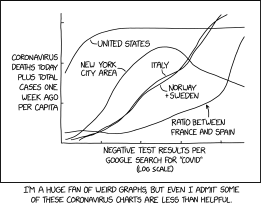
Coutesy of XKCD
(note: that this works perfectly well on iPhones, but it's better on an iPad)
(note note: uses UMD plot package version )
I have been keeping statistics of the cases and deaths, and being a physicist who is used to looking at data and doing fits, I'm presenting what I see. First, it's always good to make plots and see what's what. But then, it's pretty easy to make plots that have information but are useless, something wonderfully communicated by XKCD!
The analysis below is meant to allow someone to look at various distributions of quantities for states in the US, and for countries on the planet. There is no analysis here, mostly because analysis depends on what the various distributions are doing, and that changes over time. I just wanted to make a site that allows easy access to the data.
Most of the data used to make these plots and tables come from worldometers.info, filling in any blanks (as of August, worldometers is pretty complete) using Wikipedia (which looks like it also gets the data from worldometers, or they both get their data from the same place). I will also go straight to the state public health web sites when necessary. You can see how worldometers defines number of cases by going here. There is also a lot of data available at the WHO web site. Toggle click for more (or less) info.
To begin, below is the data for many countries (ones with
more than around 10,000 cases) in the various continents. I've only collected data
for a limited number (and will slowly add more), and those countries where there is
data are shown in the map as colored. Those that I don't have data for are greyed out.
Click on the country, and the data will be graphed, and the country border will be
redrawn in white. Click again to turn that country off. Since it's difficult to see
the detail for some regions (like Europe), you can zoom in on a region by dragging
down and adjusting the region you want to zoom in via the yellow box that appears.
Release it and you will see a zoom for that region. To "unzoom", hit the "Back"
yellow button in the upper left corner of the map. There is only one level of zooming.
To the left of the graph, you can see the names of the continents. If you click on
the name, the font turns to bold, and the sum of all the countries for that continent
is plotted. So it's not all of the countries in
those continents, but it's the ones with the largest number of cases so far.
In the control windows just below the map, you can change the
vertical scale in the text window labeled "Vertical scale set to:", or hit the "Large",
"Medium", etc buttons to change the vertical scale. "Larger" and "Smaller" can be used
to fine tune the scale. Below that are some radio buttons that you can use to
select what data you want to plot. "Ave new cases" and the same for deaths uses a
7 day average, where what is plotted at any given date is the average for that day and
$\pm 3$ days around that day.
Toggle click for more (or less) info
about colors.
BACK TO TOP
Below you will see two "radio" buttons: "Data Table" and "Data Plot".
If you click on the "Data Table" button, it will take the state that you are clicking on
and display the table of various quantities for that state.
If you click on "Data Plot", it will let you make plots of different
kinds of data for the different states.
You will see that the column headings are "Date", "Tot Cases", etc. in blue.
The last column, "Pos rate", is the number of new cases divided by the number of new tests
for a given day.
If you click on any of the blue titles, it will sort all of the states according
to that attribute.
For example, click on "New Cases" and it will sort according to which state had the
most new cases.
To go back to just displaying the data for a state, just click on the state in the map.
Note that this table will show you whether there are any problems are in the data.
For instance, click on a state that has a very dark color and you will see a
a value of 0 "New Cases". This can happen for 2 reasons:
there really might be no new cases, or
worldometers hasn't recorded it yet.
Toggle click for more (or less) on test
accuracy.
We seem to be gaining on this virus. The largest outbreak has been in the New York metro area,
and it definitely flattening. Most of the states seem to have either a zero acceleration
(linear increase) or even a small negative acceleration (flattening), which is very good.
However, this is just using data that has been presented, and even given good intentions of
the people who present this data, it will still have biases, systematics, problems. The real
epidemiologists that are studying this are using simulations that start with data on how people
interact and how contageous this virus really is. There's so much we don't know about the
virus, but every day people are learning and tuning their models. Some of the best sites, IMHO
only:
On the other hand, science is pretty powerful. And the biological sciences in this country is
extremely well funded (and could be even better funded). There are lots of people working in it,
and many of them are turning their attention to covid-19. They are bound to come up with
something good. But it probably won't happen instanteously. However, look at what happened when
HIV/AIDS became a priority - having that virus was a death sentence. Now, it's a manageable health
issue for people who get it. That did not happen accidentally, and we learned a great deal about
viruses, DNA, RNA, etc since then. This is bound to happen again.
Finally, as is true with most of the issues that humans face, we can be our own worst enemy. People
do seem to rise to the occasion however, but then what can you do about things like this:
Last updated Aug 21, 2020 Drew Baden
All rights reserved. No part of this publication may be reproduced, distributed, or transmitted in any
form or by any means, including photocopying, recording, or other electronic or mechanical methods, without
the prior written permission of the publisher, except in the case of brief quotations embodied in critical
reviews and certain other noncommercial uses permitted by copyright law.
Global Cases
Set Vertical Scale:
or make Vertical Scale:
Vertical scale set to:
Horizontal limits:
to
Normalize to 1M population
US States
Data Table
Forward
![]()
Date for colors:
![]()
Backward
Click to show data for
A brief aside on test accuracy
Bottom Line
Of course, what we want to know is "what's going to happen". That's very difficult to say, there are
just too many variables. But one thing we know, nature is relentless and usually does not pay too
much attention to what we want to believe.
Coutesy of XKCD
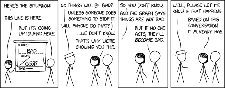
Coutesy of XKCD