Introduction | Back to top |
So why develop yet another? There are lots of reasons:
What is usually the case in science is that we need histograms, scatterplots, and functions, and this is what this package provides (so far just scatterplots and histograms but functions are on the way). No bar charts, pie charts, etc, just basic histograms and scatter plots.
Access | Back to top |
<script src="/location/plots3.1.js"></script>where "location" is of course dependent on where you put the code.
<div id="mydiv"></div>Note that if you leave off the </div>, then HTML won't complain but the entire hierarchy of what's in that div will be messed up. So don't forget to close the div!!
let plot = new UMD_plot("mydiv");
where "mydiv" is the id of the <div> that you put in step 2.All plots, whether histograms,scatter plots, or functions (or whatever is implemented) are drawn in an HTML5 canvas (<canvas>) and that is created in the constructor ("new..."). See below for details.
Version | Back to top |
	let plot = new UMD_plot("mydiv");
	.
	.
	.
	console.log(plot.version);
Usage | Back to top |
To make a scatterplot, let's say you have some data you want to plot, here we will make an array called y and fill it with 100 random numbers.
	let y = [];
	for (var i=0; i<100; i++) x.push(Math.random());
If the <div> id is "divid", then we invoke a new UMD_plot object via:
let plot = new UMD_plot("divid");
This will set up all the values and methods for plotting the function onto a canvas that
will live inside the "divid" div. To plot, you do this:
plot.plotit(options)The variable options is a javascript object that you fill in, and it will contain things like the size of the plot in pixels, the data to plot, colors, fonts, etc. The table below will show you the available options, and the defaults.
The following lists the different ways available to show the plot
	{
		data: y,           // y is an array of data points for the vertical
		type: "line",      // or "circle" or "box", not case sensitive
		color: "green",    // or "blue", or "#31421" or "rgb(122,32,51)", not case sensitive
		size:  0.5,         // line thickness for type "line", radius for "circle", side for "box"
		fill: true         // true for fill, false for stroke (open box, open circle, not applied to "line")
	}
This means that if you wanted to have the above object in the options, you would do this:
	let yobj = {
	    data: y,
		type: "line",
		color: "green",
		size:  0.5,
		fill: true
	};
	options = {
	 ydata: [yobj],
	 .
	 .
	 .
	};
If you wanted to plot 2 different data sets, say y1 and y2, then you would need
a yobj1 for y1 and yobj2 for y2 and you would put them into your options
like this:
	options = {
	 ydata: [yobj1,yobj2],
	 .
	 .
	 .
	};
and of course with all other options you might want (see below)
Also, if you just want to plot ydata values sequentially, using the index as the x-axis points, just do this:
xdata: "sequential"Actually, that's the default so if you leave it out, it should still work, and plot the values in the ydata objects sequentially.
	let plot = UMD_plot("mydiv");
	let yobj1 = {
	    data: y,
		type: "line",
		color: "blue",
		size:  0.5,
	};
	let yobj2 = {
	    data: y,
		type: "circle",
		color: "red",
		size:  3,
		fill: false
	};
	options = {
	 ydata: [yobj1,yobj2],
	 title: "this is the overall plot title",
	 xtitle: "this goes along the bottom horizontal",
	 ytitle: "this goes along the vertical to the left"
	 width: 500,
	 height: 600,
	};
	.
	.
	.
	plot.plotit(options);
Options | Back to top |
| Option | Description | Example | Default |
|---|---|---|---|
| background | background color | "grey" or "#A5A5A5" | "white" |
| use_xlabels | boolean to control using x-labels (see below) | true | false |
| xlabels | array of labels along x axis | [0,2,4,6] | n/a |
| title | title string | "My Title" | blank |
| font | this is the font used for everything | "14px arial" | "Courier" |
| font_size | size of the font | 14 | 12 |
| font_color | color of all fonts | "white" | "black" |
| grid | boolean to control displaying grid | false | true |
| grid_color | color of horizontal and vertical grid lines | "black" | "#d0d0d0" |
| xgrid | number of grid lines along x-axis | 4 | 5 |
| ygrid | number of grid lines along y-axis | 5 | 6 |
| width | canvas width in pixels | 500 | 400 |
| height | canvas height in pixels | 500 | 400 |
| xtitle | horizontal axis title string | "Age" | blank |
| ytitle | vertical axis title string | "Number" | blank |
| xmin | horizontal min value for displaying | 1 | minimum x value from array |
| xmax | horizontal max value for displaying | 1 | maximum x value from array |
| ymin | vertical axis min for displaying | 0 | maximum y value from array |
| ymax | vertical axis max for displaying | 20 | minimum y value from array |
Histograms | Back to top |
let hist = UMD_plot("divid");
To make the histogram, you call the method histogram with options:
hist.histogram(options);The options argument is the same object that you use for scatterplot, with an additional argument that is used for histograms:
	options = {
		title : "your title",
		.
		.
		.
	    hist = {
			bins: "number of bins"
			data: "1-d array of points to bin"
			xlow: "low edge of low bin"
			xhigh: "high edge of high bin"
			color: "color of the histogram"
			fill: "boolean for fill (true) or stroke (false)"
			stats: "boolean, true for display, false to not display"
		}
	}
Calling hist.histogram(options) will bin the histogram and pipe the arguments off to the
scatterplot method for drawing.
Interactions | Back to top |
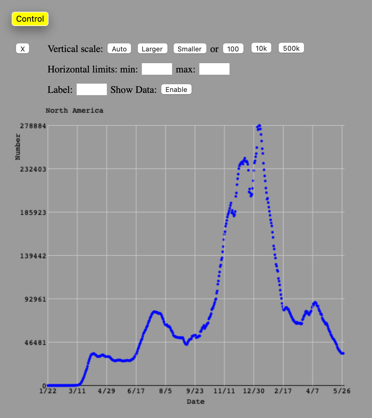
On the 2nd row, you will see text boxes to set the horizontal limits (min and max). To set these limits, type in the value and hit return. The plot is redrawn with that limit.
On the 3rd row, the "Label:" text box allows you to type in a label that you want to put on the plot, so you can label multiple plots, etc. The way you use this is to type in the label, then click on the plot somewhere, and the label is drawn there. If you don't like where the label is drawn, click on the label (on the plot) and it will disappear, then click somewhere else and it is redrawn. The "Show Data" is a button that if you click on it when it says "Enable", it enables you to mouse over the plot data and it will type out the x and y value. Once you enable this feather, the button will change to "Disable" and if you click on it again, this feature is disabled.
Testing | Back to top |
All rights reserved. No part of this publication may be reproduced, distributed, or transmitted in any form or by any means, including photocopying, recording, or other electronic or mechanical methods, without the prior written permission of the publisher, except in the case of brief quotations embodied in critical reviews and certain other noncommercial uses permitted by copyright law.