Chaos Theory
The double pendulum phase space plot from the section on the double pendulum shows extremely chaotic behavior. This is indeed a manifestation of what is known as Chaos Theory, a branch of mathematical physics that deals with the behavior of non linear systems (double pendulum, weather, etc). It's a beautiful theory, and worth going into a little.
The term "chaos" was coined by Jim Yorke and Tien-Yien Li in their paper "Period Three Implies Chaos" (American Mathematical Monthly, Vol 82, No. 10, Dec 1975, pp 985-992). That seminal paper started by discussing a recursive equation, which is an equation where the evolution of a variable $x$ depends on successive values. A common instance of such an equation is $$x_{n+1} = x_n\cdot R \cdot (1-x_n)\label{exn}$$ This equation cannot start at $x=0$, or the value of $x$ will never evolve. So as an example, let's set $R=2$ and start with $x_0 = 0.1$. We can then calculate $x_1 = 0.1 \cdot 2 \cdot (1 - 0.1) = 0.18$, and similary $x_2 = 0.2952$, $x_3 = 0.4161...$, $x_4 = 0.4859...$, $x_5 = 0.4996...$, and anything after $x_5$ just gets closer and closer to $0.5$. The sequence therefore converges. The following shows the "trajectory" of the sequence ($x_n$ as a function of $n$), you can change the values and see how it behaves by hitting the "Plot" button:
$x_0$: $R$:
The next question you might ask (and just about everyone did!) was how the sequence behaves when you start at some constant (and small) value, like $x_0=0.1$ and change $R$. You can do that by changing the value of $R$ in the above plot, or you can use the slider in the next plot to change the value of $R$ and see the first 100 points of $x_n$, where we have set $x_0=0.1$. Try varying $R$ to the following to see some amazingly interesting characteristics (you can also change the x-axis minimum and maximum to see things more clearly, just change the values in the text windows below and hit return)
- As you increase $R$ to around $R=2.44$, you can see the plot of $x_n$ converge quickly at around the 4th iteration to a constant value: for instance at $R=2.44$, it converges to $x_n=0.6$ (if you click on the plot line, it will show you the value of the point)
- At $R=2.8$, you can see that after an initial rise, there's an oscillation that dies out (converges to a constant) after around the 20th iteration.
- At around $R=3$, the oscillations die out very slowly (set the plot x-max to 2000 to see this clearly). If you change $R$ to anything above $R=3.0$, even a very small value, e.g. $R=3.0001$, the sequency $x_n$ converges to an oscillation with a constant amplitude between 2 values, aka "period 2".
- At $R=3.3$, notice that the convergence settles down to a constant period 2 at iteration 16. At $R=3.33$, the convergence is at iteration 24. If you change the least significant digit to any other value, e.g. $R=3.32$ or $R=3.34$, you will see that the convergence happens earlier, and that a least significant digit of 3 gives you a convergence at the the largest value Now keep adding significant digits, but make them all 3. At $R=3.333$, the convergence is at 32, at $R=3.3333$ the convergence is at 40, and so on. Also, notice that as you increase the number of significant digits, the sequence $x_n$ converges to a value of $0.7$ longer, and the oscillations start later. It is interesting that the convergence happens at a value for $n_c$ given by $n_c = 8\cdot n_3$ where $n_3$ is the number of 3's in the value for $R$, including the most significant digit.
- Above $R=3.43$, you can see that the oscillations converge to values that change slightly with every iteration number: "period 4". At $R=3.5$, the pattern is very pronounced, and period 4 can be seen clearly. At $R=3.58$, the pattern is still somewhat regular, but the period now is larger than $2$. At $R=3.6$, it is not at all clear what the period is.
- At around $R=3.9$, the oscillations seem to be random, and not really oscillations that have some specific frequency or frequencies.
- Above $R=4.0$ but not including $4.0$, the sequence diverges. The closer you get to $R=4.0$ the futher out in $n$ you can go before diverging.
| $R = $ | ||
| Log? | Plot x-axis min: Plot x-axis max: |
The above plot uses an initial value of $x_1 = 0.1$, and shows that for values of $R\gt\sim 3.5$, the system as described by equation $\ref{exn}$ is extremely non-linear, and at $R\gt 4$ the system diverges. In the plot below, you can see the behavior of $x_n$ vs $n$ for whatever value of $R$ you set in the plot above (with the slider), while changing the initial condition $x_1$. For example, try setting $R=3.8$ above. The slider below allows you to change the initial value of $x_n$ ($x_1$), and the 2 push buttons labeled $-0.001$ and $+0.001$ allows fine control at the $0.001$ level. What you can see clearly is that the behavior of the system is very sensitive to the initial conditions. This is also known as the "butterfly effect", which comes from applying this sensitivy to the weather: if a butterfly in China flips its wings or not, it could mean the difference between a hurricane on the other side of the world, or not.
| $x_1 = $ | 0.1 |
In the discussion above, we've looked at the behavior of the sequence $x_n$ as a function of $R$, and seen that the sequence either "settles down" to a single value, 2 values, a set of values, not any values, or diverges. So what is interesting is to plot the behavior of the sequence using the "settling down" (asymptotic) values, as a function of $R$. This is shown in the plot below. You can see the behavior of $x_n$ as a function of $R$, and using the line of text widges just above the plot, vary many of the parameters to see how things behave. $R$ is varied between the limits $R_s$ and $R_f$, and $x_n$ is plotted along the vertical between the limits $0$ and $x_f$, and $x_1$ starts at $x_s$. On the right, the variable $N_{pts}$ tells you the number of points along the horizontal between the limits $R_s$ and $R_f$. For each value of $R$, the program generates $N_{iter}$ values of $x_n$ (so $n$ goes from 0 to $N_{iter}$). To show the "settling down" values, the program will plot only the last fraction of the values of $x_n$ that will be plotted, $f_{iter}$, which you can change by varying $f_{iter}$. So if you set $f_{iter}$ to $0.25$, then if e.g. $N_{iter}$ is $40$ the program will plot the last $10$ values of $x_n$ (n=30-40).
The initial values in the text boxes shows a plot that has $x_n$ converging rapidly to 0.0 up until when $R\sim 1$, then $x_n$ converges rapidly to an increasing value up until around $R\sim 3$, where $x_n$ starts oscillating between 2 values (period 2). At around $R\sim 3.5$, the structure gets pretty interesting. To see more of that structure, you can set limits on the starting and ending values for $R$ by changing the values in the boxes labeled $R_s$ and $R_f$ respectively. You can also do this graphically by using the mouse to zoom in: drag an increasing green rectangle around the region of interest. The program saves each of the set of values $R_s$, $R_f$, $x_s$, and $x_f$, and stores them in an array, so you can go back to previous sets by hitting the "Back" button. It's pretty interesting to zoom in on that area where the behavior of $x_n$ bifurcates twice. What you can see is that at some point, the bifurcating becomes chaotic. Successive zooms around this area of interest shows a similar pattern again and again, no matter what scale you are on. (Note that due to things like the finite resolution of the javascript canvas and flotaing point numbers, as you zoom in you might need to increase $N_{iter}$ and $f_{iter}$ to see the pattern well.) This scale independence is an important concept, discussed below, and is characteristic of extremely non-linear chaotic systems.
There's another way to look at the equation $\ref{exn}$ graphically. That equation can be seen as a 2-step equation:
- Step 1: starting with a value for $x$, we use the simple equation for a parabola $y = Rx(1-x)$ to compute a value for $y$.
- Step 2: move that value of $y$ into $x$ using the equation $y = x$
| $N_{iter}$ | $f_{iter}$ | $R_s$ | $R_f$ | $x_s$ | $x_f$ | $N_{pts}$ |
As seen above, "period 3 implies chaos" is clear: once the oscillations go to Non-linear systems that exhibit this kind of "chaos" are all around us in nature (turbulence in general, weather being one of the main applications), and a prime attribute of the behavior of these systems is the sensitivy to initial conditions. Just like in the double pendulum!
Fractal geometry is both interesting and beautiful, can be extremely simple to illustrate,
and as stated above, are everywhere. The main characteristic of something that has
a fractal geometry is that it is scale independent. That is, no matter what scale you
view it, it "looks the same", that is, it has the same general features. For instance,
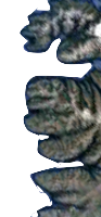
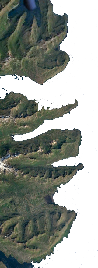
imagine that you wanted to measure the coastline of some island, like Iceland, as in
the following 2 figures: the coastline from 1000 and 100 miles respectively. Which is which?
You might use the resolution of the images to tell you the answer, but if you only looked at
general features of the coastline, and how it meanders, there's not much to tell you which scale
is which picture.
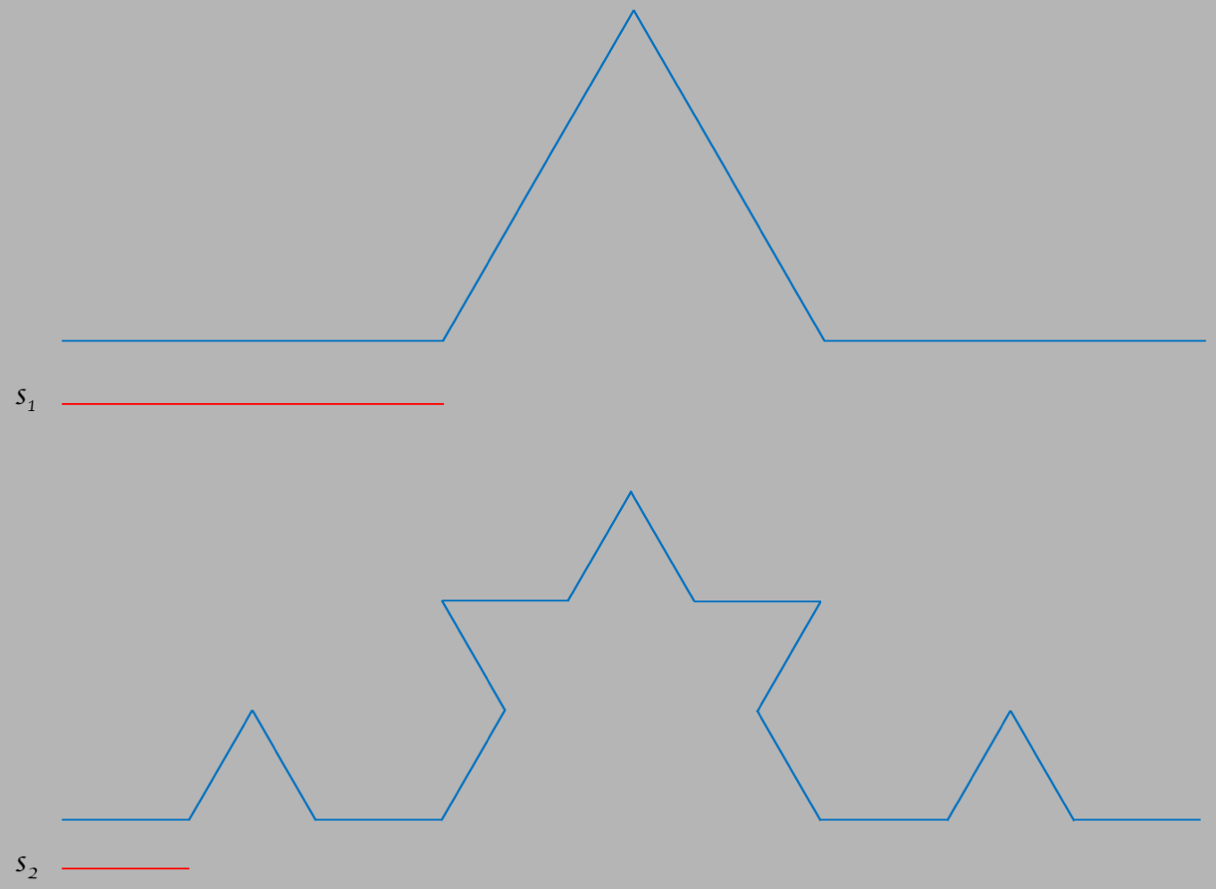
To see this more clearly, the figure below is from a famous curve called the "Koch curve".
It's a simple construct of 4 straight lines that portion off a total width $w$ into 3 parts.
Each line segment has equal length, the two with a vertical component forms 2 of the 3
sides of an equalateral triangle.
If we use the scale factor $s=w/3$, the length of each of the 4 parts of the curve,
then we will need $N=4$ "rulers" to measure the length, which is given by
$L=N\times s=4\times w/3=4w/3$, or $4/3$ in units of the
width $w$. This curve is labeled by $n=1$, which will become clear below.
When you hit the button labeled "Increase", it will take each of the 4 straight segments and
exchange them for the same shape as the overall curve squeezed down onto each of the
segments, so where there used to be 1 segment, there
is now 4. If we also divide the scale factor $s$ by $3$, so $s\to s/3 = w/9$, we would then
need $N=16$ segments to cover the entire curve.
The total length is therefore given by
$L=N\times s=16 \times 1/9=1.777...$ in units of $w$. This curve is labeled by $n=2$.
Keep hitting "Increase", and you will see what happens. Each time you do, $s$ is divided by
$3$ and $N$ is multiplied by $4$, so $L\to L\times 4/3$: the length grows with each increase in
$n$, along a straight line with slope $4/3$.
(Note that after around $n=6$ or so,
you won't be able to see much of a difference in the shape due to
the limited resolution of whatever computer screen you are using.)
This is remarkable, and it's pretty
much counter-intuitive how the length grows linearly even though the change for each segment
becomes infinitesimally small. The important thing here is that for a Koch curve that has
infinite length ($n\to \infty$), no matter what scale you choose the shape will be the same,
so the curve is scale invariant (has the same shape on all scales). This scale invariance
is what makes the Koch curve fractal.
One usually thinks of dimensions as being described by integers. For instance, to describe
to someone the location of any point $P$ on a straight line, all you need to do is agree on an
"origin", and a "scale" $s$ (meters, inches, etc), and then say that you go some number $x$
of units
from the origin to get to the point, which means $P = x\times s$ where $x$ can be
any number, positive or negative. In fact, the line doesn't have to be straight, it can be
any curve, and you still would only need a single value $x$ to find any point. That you need
$1$ number means that a line or curve is 1 dimensional. Here we make a direct connection
between the words "dimension" and "coordinates":
the dimension is the number of coordinates needed to specify a point, and this use of dimension
can be described as the "topological dimension".
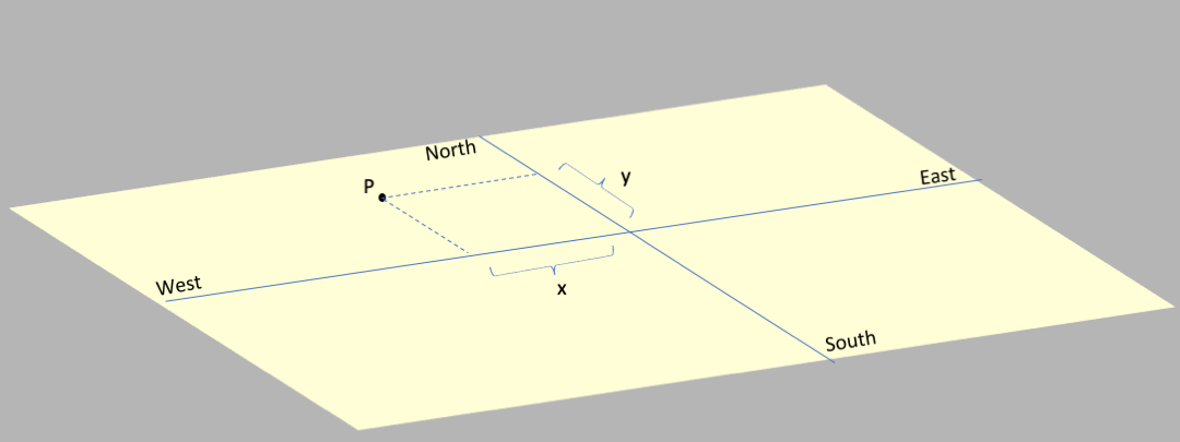
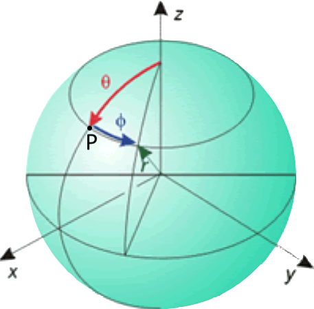
For a surface like a plane you follow the same rule: specify the origin, and the scale,
and then any point (labeled $P$ in the diagram)
can be described by 2 numbers: an amount $x$ along the East-West
direction and an amount $y$ along the North-South direction.
So a sphere and a plane, both surfaces, are 2 dimensional (topologically)
since they require coordinates
with 2 numbers to describe all points on them.
What we want to do is understand how the scale factor $s$ is related to what we want
to measure, and consider how this changes with varying numbers of topological dimensions.
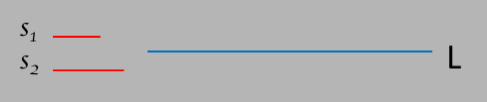
Let's start with a few easy examples. In the figure below, you will see a blue
straight line of length $L$, and 4 different scale factors labeled $s_1, s_2$, etc.
To calculate the length $L$ you would pick a scale factor, say $s_1$, and
count how many of them ($n_1$) you would need to measure the length $L$.
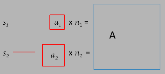
Now let's consider a surface as in the following 2 dimensional figure.
The scale factors are still just line
segments of some length, say $s_1$ and $s_2$.
The areas $a_1$ and $a_2$ made by each scale factor is given by $a = s^2$,
and the area $A$ of the figure we are trying to measure will be given by
$A = na = ns^2$.
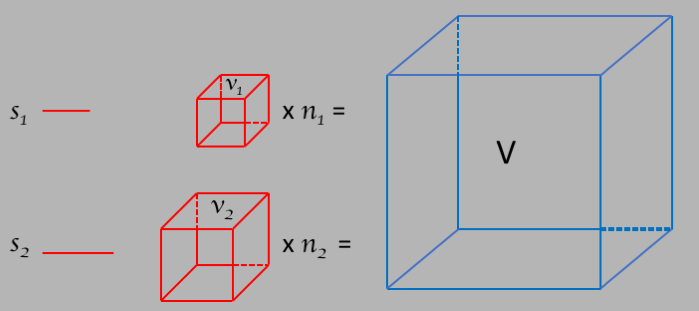
For a volume, as in the following figure:
As you can see from these 3 examples, the number of scale factors needed to
measure the $d$-dimensional shape grows as $s^d$, and this gives us a handle in
determining $d$:
$$d = \frac{log(n_1/n_2)}{log(s_2/s_1)} = \frac{-log(n_1/n_2)}{log(s_1/s_2)}\label{e_dim}$$
What this tells us is that we can think of the dimension as something that tells us
how the measure of the extent of an object changes with a changing scale factor: if
the measure changes with the scale factor $s^2$, as in the 2d figure above, then the
dimension is 2. And so on. This means that we can
determine the dimensionality $d$ by trying several scale factors $s$ and seeing how the
number of those scale factors $n$ changes as we change $s$ and extract the fractal
dimension $d$ using equation $\ref{e_dim}$.
Now that we have such a formula, let's apply it to the Koch curve, starting with the
simplest version:
We want to know how the length as measured changes with changing the scale factor
and using that scale factor to increase the complexity. So for the above diagram, we form
two different Koch curves with 2 different scale factors that have a ratio of
$s_1/s_2=3$. For the top curve, the length would be equal to $n_1=4$ times the scale
factor $s_1$, and for the bottom, the length would be equal to $n_2=16$ times the
scale factor $s_2$. Using equation $\ref{e_dim}$ we can calculate the
fractal dimensional to be:
$$d = \frac{log(n_1/n_2)}{log(s_2/s_1)} = \frac{log(4/16)}{log(1/3} = 1.262\nonumber$$
So the Koch curve has a fractal dimension of $1.262$!
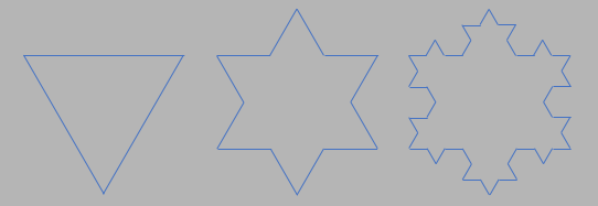
Now we can extend this technique to consider shapes beyond curves. The following figure
takes the Koch curve and uses it to form what is known as "Koch snowflakes". The
figure on the left is the simplest - a triangle. Next to the triangle is a figure
formed by taking each side of the triangle and turning it into a Koch curve. The
figure on the right is the 2nd order Koch snowflake.
The amazing thing about the Koch snowflake is that the area is finite as the
complexity increaeses (it will never get bigger than the circle that encloses the
simplest version of the snowflake, the one that has 3 points only made from a triangle)
but the perimeter becomes infinite! Beautiful!
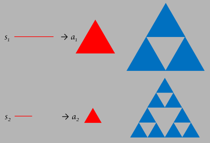
Another example of a figure that has a finite fractal-like area is the Serpinski gasket. The
figure starts with an equalateral triangle, as in the figure below. If you hit the button
labeled "Increase", it will replace the triangle with 4 triangles, but will leave out the
center triangle. The total area (the red triangles) is therefore reduced by 1/4. Each
time you hit "Increase", it will replace all red triangles with 3 smaller ones, again reducing
the area by 1/4. Below the triangle is a table of the number of red triangles, and the
area in units of the original area ($n=1$). As you can see, as you keep increasing the
number of triangles, you decrease the area, which will go to $0$ asymptotically.
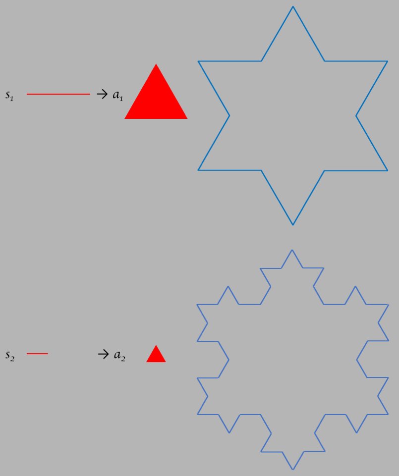
To calculate the fractal dimension, just like we did for the Koch snowflake we take
2 different scales as in the figure below. The ratio of the scale factors is given by
$s_1/s_2=2$. For the upper curve we need $n_1=3$ times $a_1$ to tile the area, and
for the bottom we need $n_2=9$.
It's interesting how the Koch snowflake figure has a fractal dimension $2.095$, greater than
it's topological dimension 2, whereas the Serpinski gasket has a fractal dimension $1.585$,
less than it's topological dimension. This must be a clue as to how to understand the
fractal dimension, and it does. But it can get highly technical mathematically. Here's
a way to understand it: it has to do with the self similarity and scale invariance of
the figure, and especially of the boundary. Remember that the topological dimension
was introduced in terms of the number of coordinate components needed to specify all of the
points in the set defined by the object. And that concept gets us back to the idea of
the set, and the boundary of the set. For the Koch snowflake, we showed that the boundary
is infinite in the limit as the scale goes to $0$, \
whereas the area is finite, so why would it surprise you that the fractal
dimension is not the same as the topological dimension? Same for the Serpinski gasket:
the boundary boundary also goes to infinity as the scale goes to zero, but here the
area also goes to zero, so it shouldn't be a surprise that the fractal dimension is less
than the topological dimension. Anyway fractals are a bit like quantum mechanics: it
gets increasingly difficult to visualize as you get into it, and you will get a headache
if you keep trying!
Perhaps the most famous example of a fractal is the Mandelbrot Set, which can be
visualized beautifully as in the figure below. It's called a "set" because ultimately
it comes down to using an iterative formula like the logistic equation $\ref{exn}$ above.
The set is defined in a 2d (topologically speaking) space, represented by and $x$ and a $y$
coordinate. For each point in the space, we apply mapping formula that consists of an
iterative function that keeps getting applied to the output of itself over and over.
A point is in the Mandelbrot set if after some amount of iterations it converges to a
finite value, and it is not in the set if it doesn't. What makes the set "Mandelbrot"
is to applythe following iterative function:
B&W
Color
Iterations:
What people usually do is to use the mathematics of complex variables to define the mapping:
define $c \equiv x_p+iy_p$ and $z_n=x_n+iy_n$ where $i=\sqrt{-1}$. Then the mapping is given by
$$z_{n+1}=z_n^2+c\nonumber$$
with the convergence condition $|z_n|\lt 2$.
In the figure above, if click the "Color" radio button, it will then associate a color
according to how many iterations of the mapping formula it took for the condition $|z_n|\gt 2$.
The Mandelbrot set is not stricly self similar, but it's close (aka "quasi-similar").
The apparent
scale invariance of the Mandelbrot set can be seen by zooming in with the cursor: click down
at a location on the map and drag to another location, you will see a box that highlights the
region. When you let go, it will zoom in. For example, notice that the Mandelbrot set has a large
"blob" that straddles the origin (the intersection of the $Re(z)$ and $Im(z)$ axes), and a blob to
the left that starts about a third of the way to the left edge. If you start by zooming in on that
left "blob", you will that blob blown up, but it will be surrounded by smaller blobs. Keep zooming
in on the smaller blobs, and you will see how the pattern repeats itself at all scales.
If you keep zooming, you will find that the picture becomes less and less sharp. This is because
you need more and more iterations to show convergence in fine color detail. So what you can try is
to increase the number of iterations in the text window, and hit the "Draw" button, and it might
do a better job. But it will also take longer, so you will have to be patient, and depending on
the finite resolution of your screen, it may not improve.
A variation on the Mandelbrot set is the Julia set, where here you keep the value of $c$ constant,
and use the coordinate pair as the starting point instead. In the figure below, you can click on
any single point in the diagram and it will redraw it using that point as the starting value for
the calculations. You can play with the number of iterations by changing the value in the
text widget and histting "Draw", and you will be surprised (and maybe entertained) at what a
difference that makes. Also, as described below, you can also play with the color scheme.
Iterations:
One can make some amazing figures with just iterative functions and a computer, as you can see from
the Mandelbrot and Julia sets above. Another popular figure is the Barnsley Fern, named after the
British mathematician Michael Barnsley from his book "Fractals Everywhere". The iterative function
is somewhat more complicated, but not more complex. It consists of 4 different 2-d functions $x_1-x_4$
and $y_1-y_4$ that are used as coordinates. Each coordinate is chosen (using a random number
generator) so that some fraction of the time the coordinate is given by $x_1,y_1$, some fraction
of the time $x_2,y_2$, and so on. This can be represented by the following 4 matrix equations,
with the standard coefficients that make the Barnsley Fern:
The miracle is that by using this set of matrix equations, determining randomly
which of the 4 sets of
functions to use, it forms figures like the one following. Note that you
will be somewhat limited by the resolution of your device's screen. The sliders allow you
to play with the 3 probabilities $p_1,p_2,p_3$ associated with the probability boundaries between
the 3 sets of functions $f_1,f_2,f_3$, just to get a feel for the sensitivity to those boundaries.
And you can feel free to change the coefficients as well and hit "Draw". Note that if you
keep hitting "Draw", it will add to what's already been drawn.
Back to TOP
All rights reserved. No part of this publication may be reproduced, distributed, or transmitted in any
form or by any means, including photocopying, recording, or other electronic or mechanical methods,
without the prior written permission of the publisher, except in the case of brief quotations embodied in
critical reviews and certain other noncommercial uses permitted by copyright law.
Fractals
Fractals and 1 Dimension
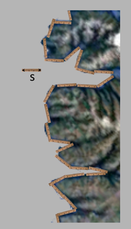
Why is this called a "fractral" geometry? That story starts with a simple question: how would you
measure the length of a coastline? You'd do this by taking some kind of ruler, or scale, $r$,
and placing it down on the figure to cover the entire length, as in the following picture:
$n=$
$L/w$:
Fractal Dimensions
$n$ $A/A_0$
1 1
The Mandelbrot Set
As you can probably see quickly, the points around $x_p,y_p=0,0$ will obviously converge, and
points far away from this origin will obviously not converge.
The Julia Set
$z_x$ $z_y$
1 1
$C=c\cdot \frac{n}{N}$
$C=c\cdot \frac{\log(n)}{\log(N)}$
$\phi=2\pi \frac{n}{N}$, and $C=c\cdot\cos^2\phi$
$\phi=2\pi \frac{n}{N}$, and $C=c\cdot(\cos\phi\sin\phi+1)/2$
$C = c\cdot (N\bmod{n})/N$
$C = c\cdot \sqrt n/\sqrt N$
The Barnsley Fern
$p_1$:
$\begin{pmatrix} x_{n+1} \\ y_{n+1}\end{pmatrix}$
$=$
$\begin{pmatrix}
0 & 0 \\
0 & 0.16 \end{pmatrix}$
$\begin{pmatrix} x_{n} \\ y_{n}\end{pmatrix}$
$+$
$\begin{pmatrix} 0 \\ 0\end{pmatrix}$
$p_2$:
$\begin{pmatrix} x_{n+1} \\ y_{n+1}\end{pmatrix}$
$=$
$\begin{pmatrix}
0.85 & 0.04 \\
-0.04 & 0.85\end{pmatrix}$
$\begin{pmatrix} x_{n} \\ y_{n}\end{pmatrix}$
$+$
$\begin{pmatrix} 0 \\ 1.6\end{pmatrix}$
$p_3$:
$\begin{pmatrix} x_{n+1} \\ y_{n+1}\end{pmatrix}$
$=$
$\begin{pmatrix}
0.20 & -0.26 \\
0.23 & 0.22 \end{pmatrix}$
$\begin{pmatrix} x_{n} \\ y_{n}\end{pmatrix}$
$+$
$\begin{pmatrix} 0 \\ 1.6\end{pmatrix}$
$p_4$:
$\begin{pmatrix} x_{n+1} \\ y_{n+1}\end{pmatrix}$
$=$
$\begin{pmatrix}
-0.15 & 0.28 \\
0.26 & 0.24 \end{pmatrix}$
$\begin{pmatrix} x_{n} \\ y_{n}\end{pmatrix}$
$+$
$\begin{pmatrix} 0 \\ 0.44\end{pmatrix}$
$f_1$ $f_2$ $f_3$ $f_4$
$x_{n+1}=$$x_n+$
$y_n$
$x_{n+1}=$$x_n+$
$y_n$
$x_{n+1}=$$x_n+$
$y_n$
$x_{n+1}=$$x_n+$
$y_n$
$y_{n+1}=$$x_n+$
$y_n$
$y_{n+1}=$$x_n+$
$y_n+$
$y_{n+1}=$$x_n+$
$y_n+$
$y_{n+1}=$$x_n+$
$y_n+$
$p\lt 0.01$ $0.01\ge p\lt 0.86$
$0.86\ge p\lt 0.93$ $0.93\ge p$
$p_1 = $
0.01
$p_2 = $
0.86
$p_3 = $
0.93
Copyright © 2020 by Drew Baden